Details panel
Table of contents
- Details panel
- Details top bar
- Expander
- Tag
- Name or id of item
- Close details panel
- Group of CTAs
- Summary
- Sections
- Sticky header
- Expander
- Marker
- Editable sections (with marker)
- Non-editable sections (no marker)
- Info icons
- Store sections
- Details top bar
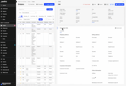
Details
To get to the Details panel, you need to select a particular item from the Listing table. The Details are divided into 3 main parts: 1) Details top bar, 2) Summary, and 3) Sections, as seen in the picture below:
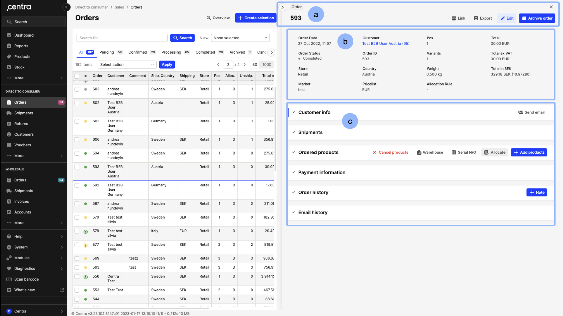
1. Details top bar
The are 5 important parts to discuss regarding the Details top bar:
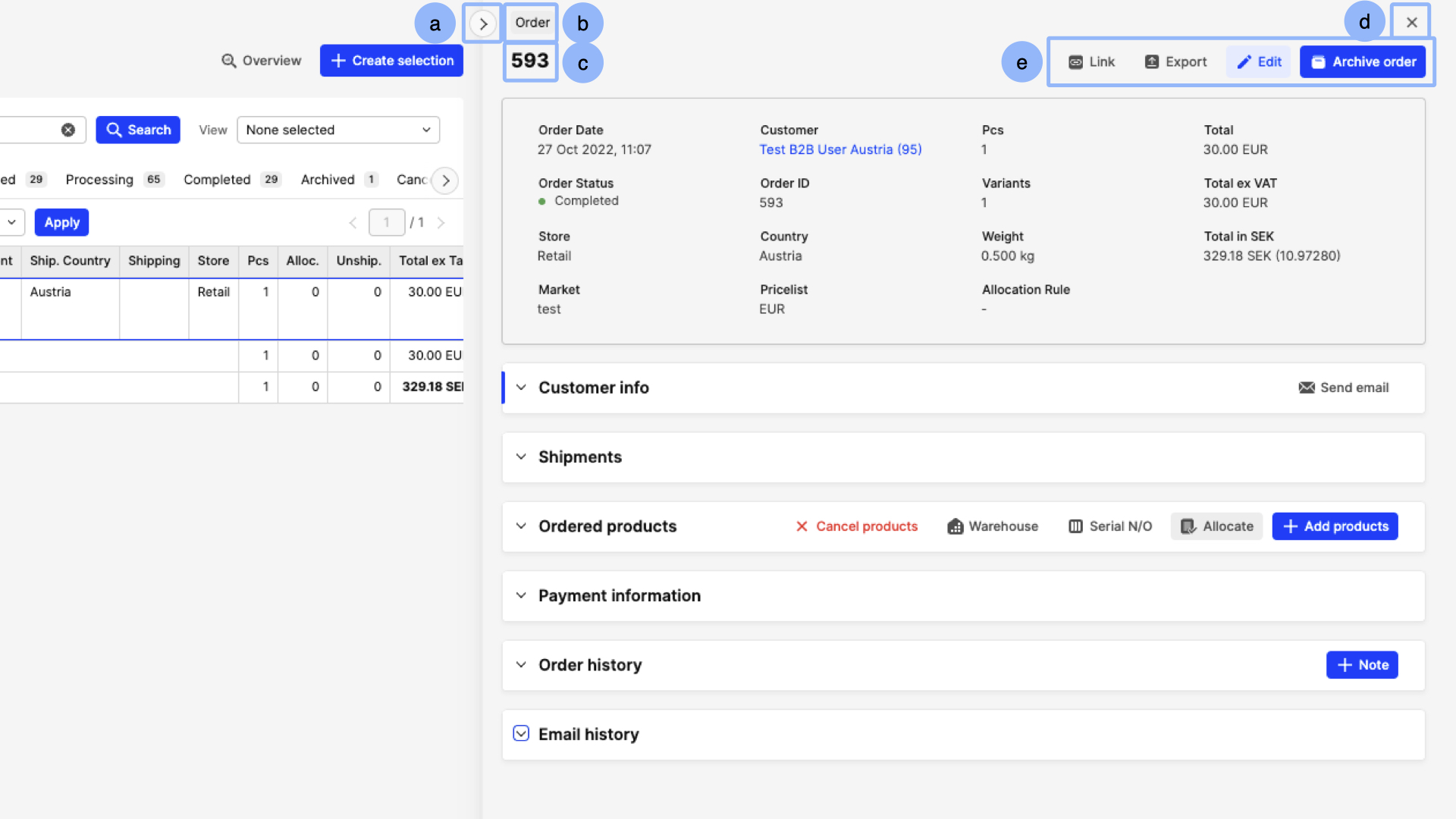
a. Expander
This arrow button allows you to move between a 2 and 4 column layout of the Details panel. The 2 column layout is a great option to have when you wish to keep an eye out on the Listing panel whilst still making changes or seeing information in the Details panel. The 4 column layout is better to use when you mainly wish to focus on the Details panel.
When the 4 column layout is used, all CTA buttons (see point 'e') are visible as text+icon, however, in the 2 column layout, an icon with three dots appears instead. Once you clicked, you will be able to see all buttons in more detail and select as needed.
It is also good to remember that Centra remembers the positioning of those sections. This means that if, for example, you use the 2 column layout, close Centra and then come back to that view, it will show the Details in the same way.
b. Tag
Here you will see the name of the Centra page you are in, so for example, Order, Shipment, Market etc.
c. Name or id of item
This includes information about the specific item you selected, so for example, a specific order or a market. Depending on the item, it would show the name (i.e. market: Sweden) or the id (i.e. order: 28).
d. Close details panel
This x button allows you to close the Details panel, which will bring you back to the full Listing panel.
e. Group of CTAs
Here you will find a number of different CTA buttons which will allow you to manage the details of the particular Centra page you are in. Note that these buttons differ between Centra pages. More details regarding the CTA buttons found on each Centra page can be found in their respective articles.
2. Summary
The Summary section includes the most important information from the Details panel. This information is not editable. Also, please note that this part can be found in some Details panels, for example in Orders, Markets, Pricelists, but others do not include a Summary section (i.e. Products, Customers, Reports).
3. Sections
Sections include 4 very convenient features: a) sticky header, b) expander, c) marker, and d) info icons
a. Sticky header
Each section includes a header at its top which is sticky. This means that if you scroll down, the header will follow you until you go into the next section. In this case, the next section’s sticky header will follow. Also note that some headers include buttons on the right side, and since they are part of the sticky header, they will also follow upon scrolling as described above.
b. Expander
The arrow found on the top left of each section can be used to expand or collapse the section itself. Note that a collapsed section is essentially the header of the section.
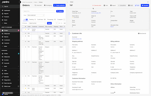
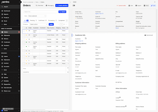
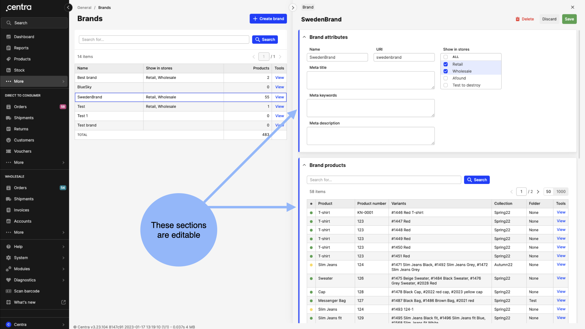
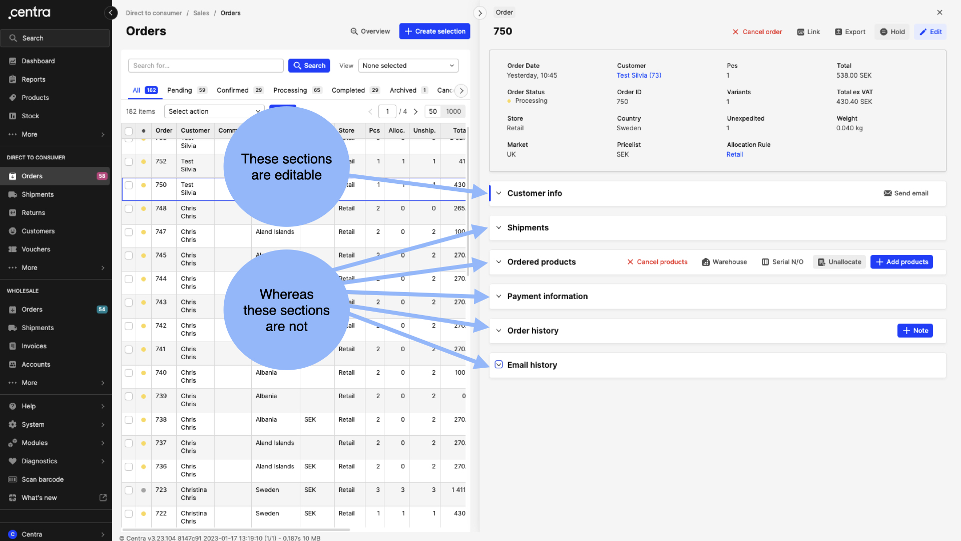
c. Marker
Some sections can be edited whereas others cannot. Let’s explore these differences in more detail below:
- Editable sections (with marker):
Sections that can be edited when the main “Edit” button on the Details top bar is clicked, are marked with blue on the left side of the section. For example, if you click “More” (General part of the navigation) > Brands > Select a Brand, you will see that two sections appear with a blue marker on their left side.
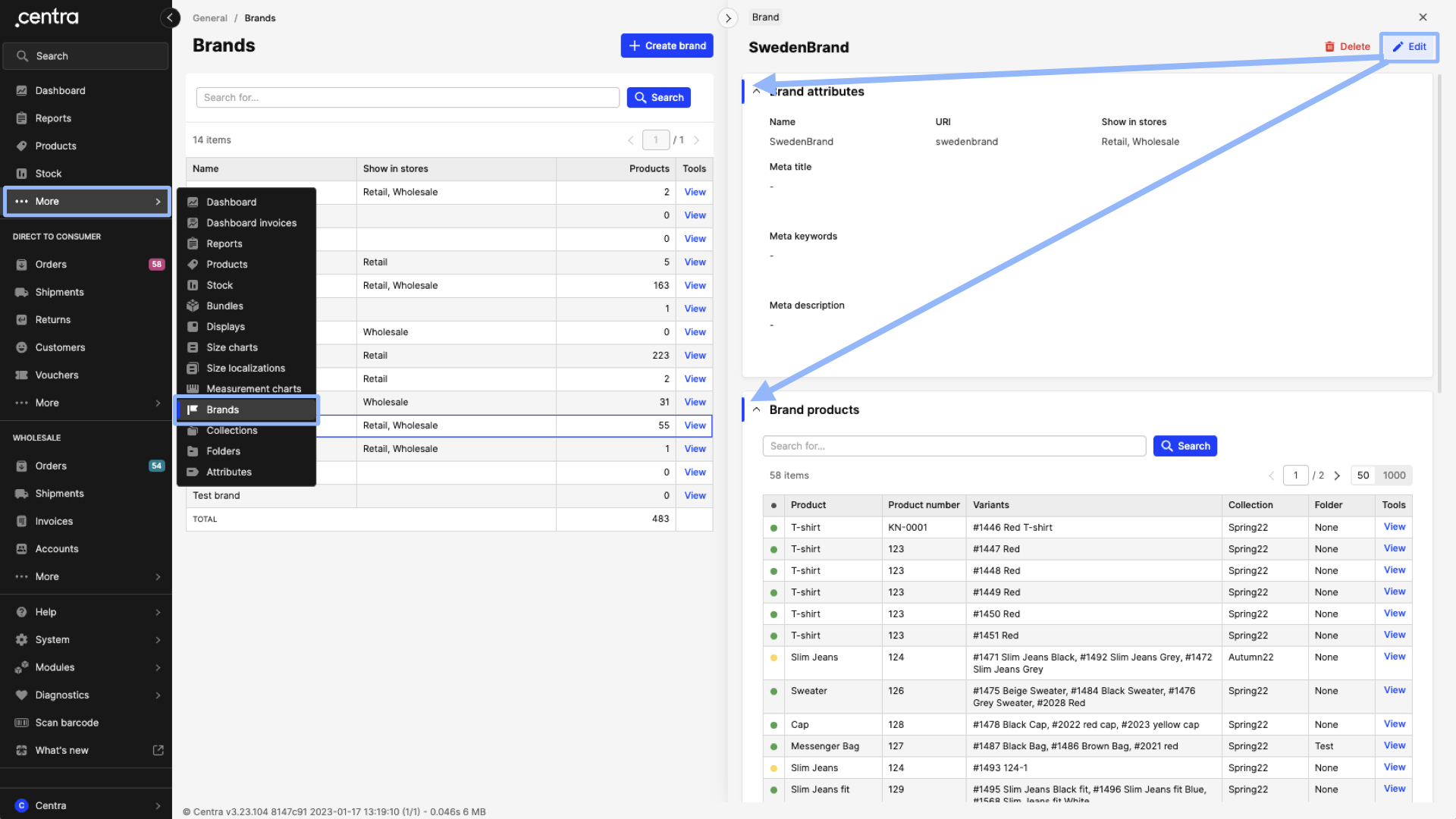
Once you edit, the marker extends, showcasing even more specifically the editable sections. Additionally, all editable sections will expand too, allowing you to manage the information of those sections. Note that you will not be able to collapse editable sections while you are in Edit mode. To be able to collapse it again, you would need to click “Discard” to stop the Edit mode, and then collapse the section if needed.
- Non-editable sections (no marker)
When a section cannot be edited, the blue marker at the left side of the section will be missing. For example, if you go to DTC > Orders > Select an order, you will see that only the Customer info section is marked with blue. The remaining sections do not include this marker.
It should be noted that there are different types of edit buttons across Centra. We go into detail in this article LINK about that to explain each use case.
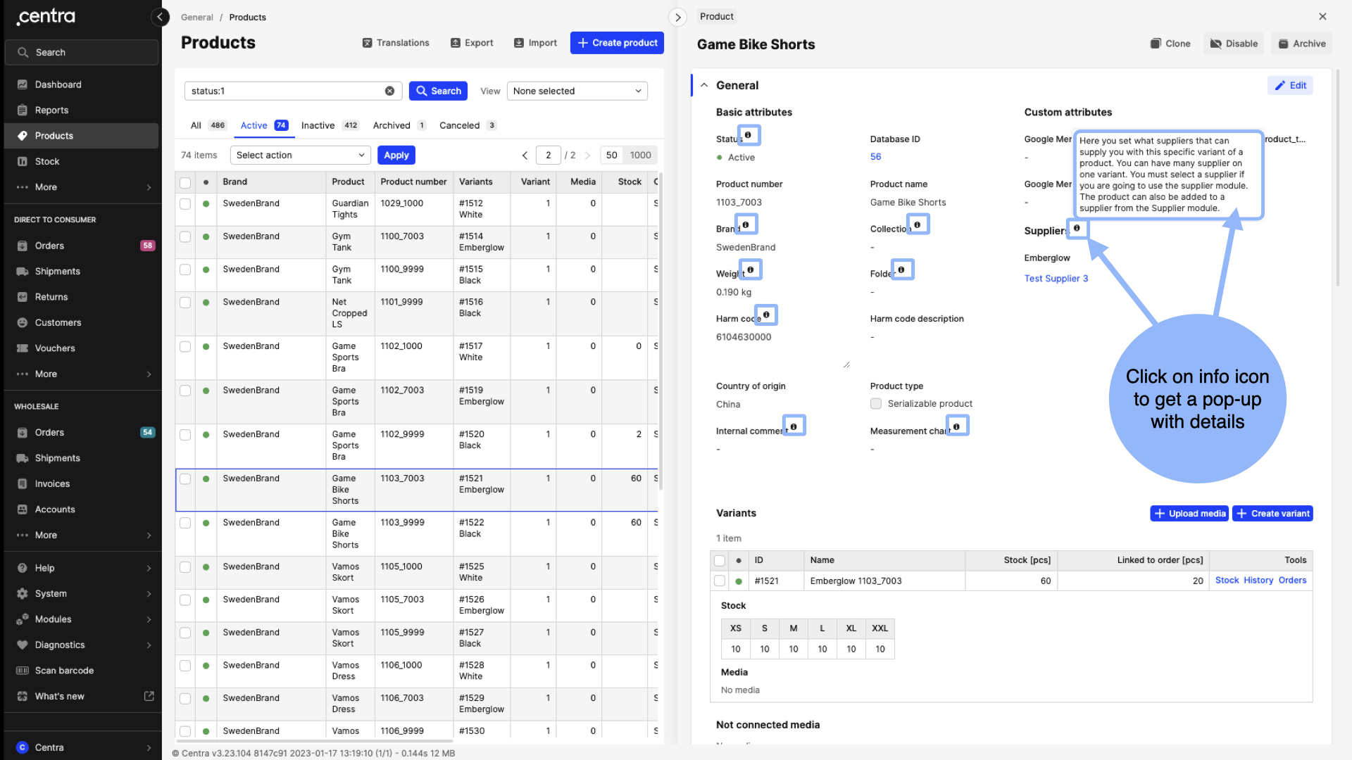
d. Info icons
Info icons can be found next to some titles. Once you click on the info icon, a pop up will appear with text that aids in understanding what the particular setting does.
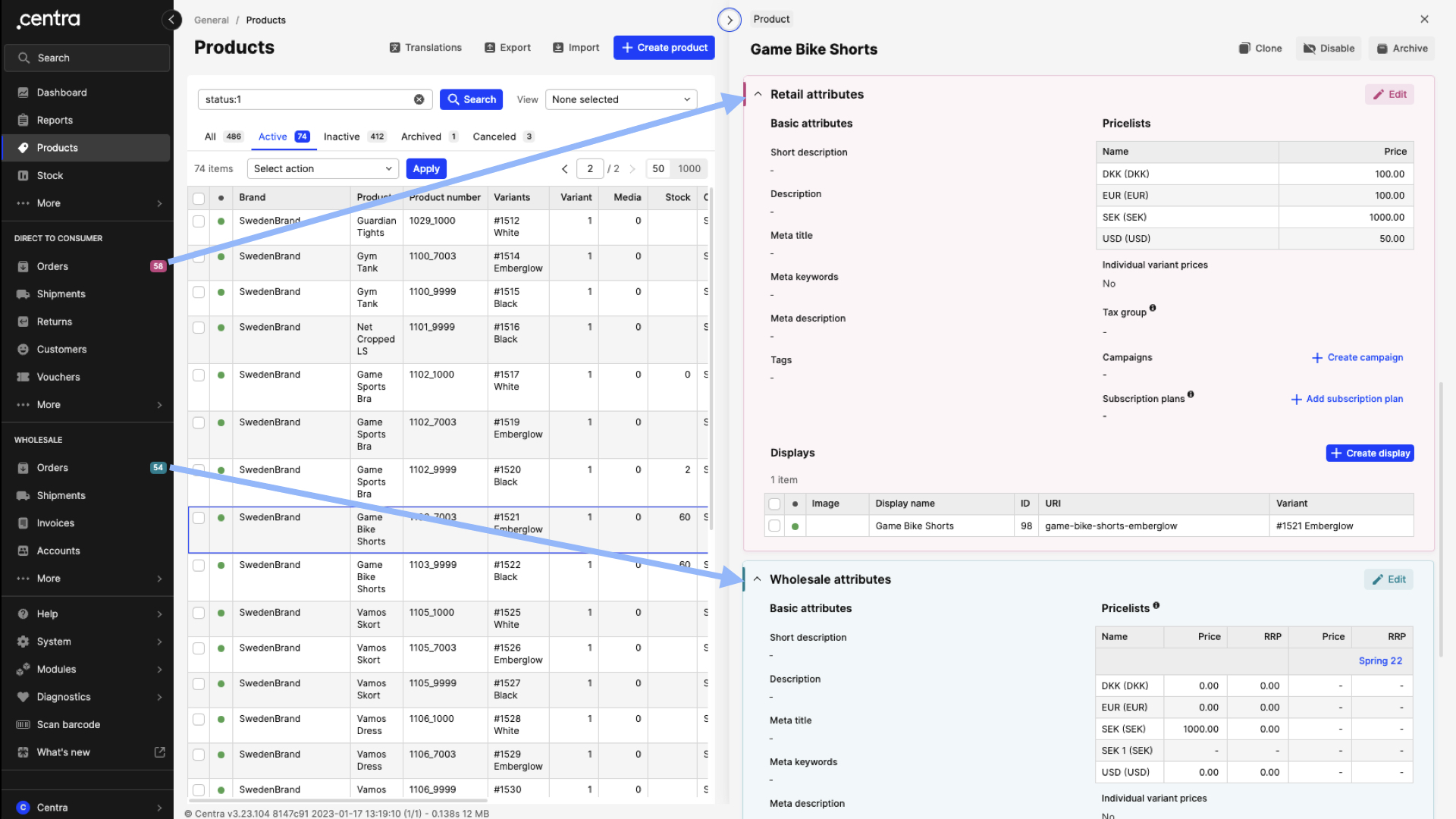
Sections
In Products and Product Translations, the store-specific sections are color-coded. The Retail attributes follow the same pink color that can also be found in the Direct to consumer part of the navigation menu. Similarly, the Wholesale attributes have the turquoise color.
Some Centra pages do not include a Details panel. Those behave differently and usually include only a Listing layout. Below you can find a list of those pages:
- General: Dashboard, Stock, Products > Import, Displays, Folders > Multiview
- DTC/WHS: Markets > Multiview, Pricelists > Multiview, Categories > Multiview
- WHS only: Accounts > Import
- System: Translations > Tags, Countries, Attributes, Gift certificates, Categories
- Certain Modules and Diagnostics tools