Add more details: Custom Attributes
Custom Attributes
Accounts, customers, displays, orders, products, variant, product medias, categories and vouchers can all be expanded with additional information. Here's how you can do it!
The following structure is used in the configuration to define custom attributes on objects listed above. Attributes allow you to create arbitrary fields that will be available in the API and exports. There are different types of attributes.
The API-outputs defined below are using the Shop API, some differences might apply to other APIs, which will be defined in the corresponding API reference.
!!!
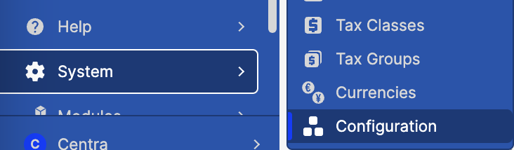
Important parts of client configuration have been moved to the Centra AMS backend panel. You can now edit relevant configuration sections with a JSON editor by going to System -> Configuration menu.
The process
Open AMS System -> Configuration. If you can’t see it, it may be because you are not logged in as a full-access admin, or this is not a QA environment.
- Make your config changes in the QA environment,
- Test the changes in QA,
- Notify us that the config should be copied to production.
Before we deploy
As you may notice, those config files are plain JSON, easy to read, tweak, and stash away for safekeeping. It might be a good habit to back up your current setup before diving into any big changes.
If you ever need a hand pushing the config to Production, Centra's staff has got your back! Just let us know after you've tested your attributes config in QA, and are ready to push it to Prod.
For security and monitoring purposes, we ask you to only schedule those Prod deployments for business hours.
Important notes
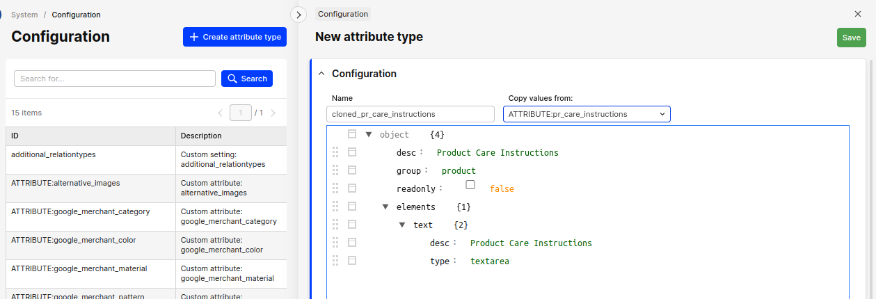
You can update and delete existing attribute definitions, and add new ones. Attribute type names are restricted to letters, digits, underscore _ and minus sign -. You cannot change the type name, but you can clone an existing attribute into a new one. Just click on the Create attribute type button and pick an existing attribute type to duplicate, then edit this copy.
Mapped and Dynamic attributes
Mapped attributes
The normal attribute on a product or variant is one which is mapped to an attribute object which can contain meta-data. There is a reason for this, for example: if you have a specific Color-attribute that contains the name, hex-code and image of the color. You do not want to upload these values every time, so an attribute is then created, which you then link to the products that should have the color. Think of mapped attributes as pre-defined const values that you can later choose from.
The example attribute structure looks similar to this:
Custom attribute: sh_swatch
{
  "desc": "Showroom Color Swatch",
  "group": "variation",
  "readonly": "true",
  "elements": {
    "desc": {
      "desc": "Color",
      "type": "input"
    },
    "hex": {
      "desc": "Hex code",
      "type": "input"
    },
    "image": {
      "desc": "Image",
      "type": "image",
      "size": "60x60"
    }
  }
}
You can then create a new Showroom Color Swatch-attribute under CATALOG / ATTRIBUTES:
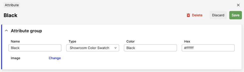
When this attribute is saved, this attribute option will be listed under the Showroom Color Swatch-title in the variant-section of the product:
In the API, the values will come out like this:
{
    "countryOfOriginName": "",
    "sh_swatch": {
        "desc": "Red",
        "hex": "#8b0000",
        "image": {
            "type": "image",
            "url": "https://.../client/dynamic/attributes/image_9471.jpg",
            "width": "60",
            "height": "60",
            "mimeType": "image/jpeg"
        }
    },
    "markets": {
        "...": "..."
    }
}
Dynamic attributes
Dynamic attributes are in comparison to mapped attributes not linked to any pre existing attribute, but do have specific data for the specific products. This data needs to be set for each product instead of linking to an existing attribute. The difference between mapped and dynamic is that dynamic uses "readonly": false for the attribute.
It used to be that if you had "readonly": false on the attribute, only the element with the text key would be visible in the API. This meant that if you needed multiple elements you needed multiple attributes as well. To keep with the previous behavior, this is still the case for single-element attributes. For dynamic attributes with multiple elements, every element will now be returned in the API as [attribute-name]-[element-name].
Custom attribute: pr_promo
{
  "desc": "Promotion",
  "group": "product",
  "readonly": false,
  "elements": {
    "limited": {
      "desc": "Limited Edition",
      "type": "boolean",
      "options": [
        [
          "0",
          "No"
        ],
        [
          "1",
          "Yes"
        ]
      ]
    },
    "preorder": {
      "desc": "Preorder",
      "type": "boolean",
      "options": [
        [
          "0",
          "No"
        ],
        [
          "1",
          "Yes"
        ]
      ]
    }
  }
}
These will show up on the product directly with a Yes / No-option:
And in the API, it will show up like this:
...
"pr_promo_limited": "1",
"pr_promo_preorder": "1",
...
Please note that when the option you've selected is 0/false the property will not show up in the API at all. For boolean attribute, no value means false.
Attribute groups
The group on the attribute specifies where the attribute should be placed. The following groups exist today:
| Group | Description |
|---|---|
product |
Listed under General Attributes on all Products. |
variation |
Listed under each Variant on all Products. |
display |
Listed on each product display |
order |
Listed on each Order. |
customer |
Listed under each Customer. |
account |
Listed under each Account (B2B). |
sizechart |
Listed under each size in a sizechart. |
product_media |
Listed under each image in AMS backend. Exposed in Checkout & Shop API. Assignable through Integration API. |
category |
Listed under General Attributes on all categories. |
voucher |
Listed under each Voucher. Exposed in Checkout & Shop API. Assignable through Integration API. |
campaign |
Listed under each Campaign. Exposed in Checkout, Shop API & Storefront API. |
Attribute element types
Element-type is inside the elements-property for the attribute configuration:
{
  "desc": "This is the attribute",
  "group": "product",
  "elements": {
    "text": {
      "desc": "This is the element-typ",
      "type": "boolean",
      "options": [
        [
          "0",
          "No"
        ],
        [
          "1",
          "Yes"
        ]
      ]
    }
  }
}
The following element types exist today. Not all of them are supported for the Dynamic attributes (which are shown inline on each product/variant), so the support for the different options are listed below:
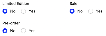
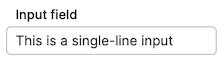
| Type | Look | Support | Options |
|---|---|---|---|
input |
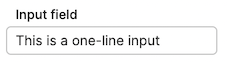 |
Mapped/Dynamic | One-line text field |
textarea |
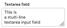 |
Mapped/Dynamic | Multi-line text field |
readonly |
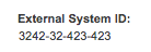 |
Dynamic | Allows a field without the ability to edit it. Used for showing IDs or things that should not be changed. |
boolean |
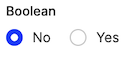 |
Dynamic | Options for the radio inputs (default is always 0): 'options' => [['0','No'],['1','Yes']] |
select |
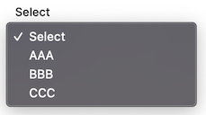 |
Mapped/Dynamic | Default selected is always first option, so keep it as ['0','Select'] |
image |
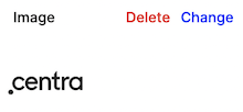 |
Mapped | Size of the image: 'size' => '600x400'. Allowed image formats: JPG, JPEG, PNG, GIF, SVG |
file |
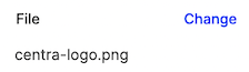 |
Mapped | No options available |
Attributes with multi-select value
Selectable mapped attributes can be configured so that multiple values can be selected at once. This is achieved by adding parameter 'multi' => true to the attribute. For example, a multi-choice Label attribute can be configured like this:
{
  "desc": "Label",
  "group": "variation",
  "readonly": true,
  "multi": true,
  "elements": {
    "name": {
      "desc": "Label description",
      "type": "textarea"
    },
  }
}
In Centra, the attribute will look like this:
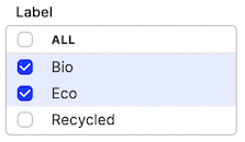
Its values will be returned as an object in API response:
"label": {
    "3": "Eco",
    "1": "Bio"
 },
API-output
The API-output differs between Dynamic and Mapped attributes.
Mapped attributes will always have a parent element named as the attribute-key. This is how the elements look like from the mapped attributes:
Custom attribute: attribute_field
{
  "desc": "This is the attribute",
  "readonly": true,
  "group": "product",
  "elements": {
    "text": {
      "type": "Input",
      "desc": "Text"
    },
    "textarea": {
      "type": "textarea",
      "desc": "Textarea"
    },
    "boolean": {
      "desc": "Boolean",
      "type": "boolean",
      "options": [
        [
          "0",
          "No"
        ],
        [
          "1",
          "Yes"
        ]
      ]
    },
    "select": {
      "desc": "Select",
      "type": "select",
      "options": [
        [
          "0",
          "Select"
        ],
        [
          "first",
          "First Option"
        ],
        [
          "second",
          "Second Option"
        ]
      ]
    },
    "image": {
      "type": "image",
      "desc": "Image",
      "size": "600x400"
    },
    "file": {
      "type": "file",
      "desc": "File"
    }
  }
}
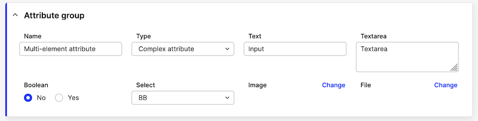
This is how the response from the API looks like:
{
    "attribute_field": {
        "text": "Text",
        "textarea": "Textarea",
        "boolean": "1",
        "select": "second",
        "image": {
            "type": "image",
            "url": "https://.../client/dynamic/attributes/image1_4265_png.jpg",
            "width": "600",
            "height": "400",
            "mimeType": "image/jpeg"
        },
        "file": {
            "type": "file",
            "url": "https://.../client/dynamic/attributes/6/image1.png"
        }
    }
}
Dynamic attributes however, will be listed inline on the product inside the API.
Remember that only the element with the key text will be shown and only if the value is not 0/false.
{
  "desc": "This is the attribute",
  "group": "product",
  "readonly": false,
  "elements": {
    "text": {
      "desc": "Text",
      "type": "input"
    }
  }
}
This is how it looks like in the API:
{
    "attribute_name": "This is the text"
}
Media object attributes can be configured both as static and dynamic custom attributes. Main difference is, in the API they are not returned for specific products, but rather for specific product media (images connected to products and variants), grouped inside the mediaObjects part of the API response.
For example, let's take a dynamic attribute for product media of type Image caption:
Custom attribute: caption_description
{
  "desc": "Image caption",
  "group": "product_media",
  "readonly": false,
  "elements": {
    "value": {
      "desc": "Caption",
      "type": "input"
    }
  }
}
Response from the Checkout API:
{
  "mediaObjects": [
    {
      "media": "1",
      "sources": {
        "standard": [
          {
            "url": "https://.../client/dynamic/images/1_9adfeff6f2-red.jpg",
            "width": 0,
            "height": 600,
            "mimeType": "image/jpeg"
          }
        ]
      },
      "attributes": {
        "caption_description_value": "Example caption"
      }
    }
  ]
}
Response from the Shop API:
{
  "media": [
    {
      "type": "image",
      "sources": {
        "standard": {
          "url": "https://.../client/dynamic/images/1_9adfeff6f2-red.jpg",
          "width": 0,
          "height": 600,
          "mimeType": "image/jpeg"
        }
      },
      "attributes": {
        "caption_description_value": "Example caption"
      }
    }
  ]
}
The dynamic attribute element types supported are all returning simple strings, so they look the same as per above.
Examples
We recommend using snake_case for all your custom attributes API names. Since Centra uses camelCase, and all the values are mixed up in the API responses, it's helpful to be able to immediately tell which attributes are custom, which also prevents the risk of accidentaly re-using already existing attribute name key.
Product care instructions
A multi-line dynamic text field for entering additional information about the Product. Can also be set up on the Variant level (group => variation).
{
  "desc": "Product Care Instructions",
  "group": "product",
  "readonly": false,
  "elements": {
    "text": {
      "desc": "Product Care Instructions",
      "type": "textarea"
    }
  }
}
This displays like this:

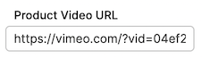
Product video
Since products videos will be different on each product, we use a dynamic input field to store video URL.
{
  "desc": "Product Video",
  "group": "product",
  "readonly": false,
  "elements": {
    "url": {
      "desc": "Product Video URL",
      "type": "input"
    }
  }
}
This will look like this in the Product page:
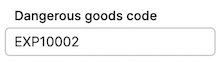
Dangerous goods
Required for some products at customs. Might differ between product categories and shipping countries.
{
  "desc": "Dangerous goods",
  "group": "product",
  "readonly": false,
  "elements": {
    "value": {
      "desc": "Dangerous goods code",
      "type": "input"
    }
  }
}
It renders as a simple input field in the UI:
Showroom swatch
Remember, Variant-level attribute use group variation, not variant.
{
"desc": "Showroom Color Swatch",
"group": "variation",
"elements": {
"desc": {
"desc": "Color",
"type": "input"
},
"hex": {
"desc": "Hex",
"type": "input"
},
"image": {
"desc": "Image",
"type": "image",
"size": "50x50"
}
}
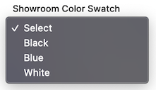
}Swatch definitions need to be configured in Catalog -> Attributes:
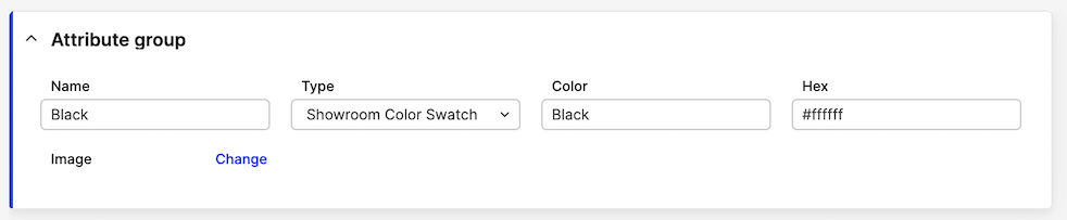
...and then selected on the Variant page:
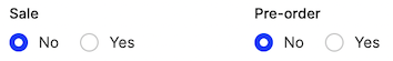
Promotion yes/no
Booleans are normally dynamic, not pre-defined. Remember, default value(s) (index 0) will not be returned in the API.
{
  "desc": "Promotion",
  "group": "variation",
  "readonly": false,
  "elements": {
    "sale": {
      "desc": "Sale",
      "type": "boolean",
      "options": [
        [
          "0",
          "No"
        ],
        [
          "1",
          "Yes"
        ]
      ]
    },
    "preorder": {
      "desc": "Pre-order",
      "type": "boolean",
      "options": [
        [
          "0",
          "No"
        ],
        [
          "1",
          "Yes"
        ]
      ]
    }
  }
}
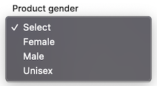
Product gender
The difference between this and Static attribute is that the select options cannot be adjusted/expanded without a code change.
Please notice, the keys are enums, not integers. Use ['0','Select'], not [0,'Select'].
{
  "desc": "Product gender",
  "group": "product",
  "readonly": false,
  "elements": {
    "value": {
      "desc": "Product gender",
      "type": "select",
      "options": [
        [
          "0",
          "Select"
        ],
        [
          "female",
          "Female"
        ],
        [
          "male",
          "Male"
        ],
        [
          "unisex",
          "Unisex"
        ]
      ]
    }
  }
}
The select then looks like this in the UI:
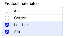
Product material - multi-select
For attributes which are pre-defined, multiple values can be made selectable at once.
{
  "desc": "Product material(s)",
  "group": "product",
  "readonly": true,
  "multi": true,
  "elements": {
    "name": {
      "desc": "Material name",
      "type": "input"
    },
    "description": {
      "desc": "Material description",
      "type": "textarea"
    }
  }
}
Multi-select snippet looks like this in Centra:
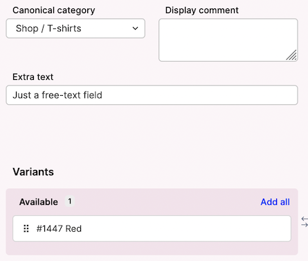
Product display additional text
You can also define custom attributes on a display level:
{
  "desc": "Extra text",
  "group": "display",
  "readonly": false,
  "elements": {
    "name": {
      "desc": "Extra text",
      "type": "input"
    }
  }
}
This renders like this:
Product media attribute
You can add text-based attributes to product media - uploaded in AMS -> Catalog -> Product -> Variants. These media-level attributes are currently not translatable.
Let's take this example, where we would like to store the height (in cm) of the model posing in the picture:
{
  "desc": "Model Size (cm)",
  "group": "product_media",
  "readonly": false,
  "elements": {
    "value": {
      "desc": "Model size (cm)",
      "type": "input"
    }
  }
}
This renders under each Image details, when you click the image in AMS backend, as:
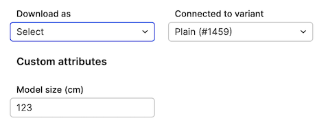
Image sizes
There are some predefined image sizes, and you can add custom ones, just like before. Each size is configured as: "size_name": [W, H, Q], where:
Wis the width of the desired image in pixels, leave as0to auto-scale,His the height of the desired image in pixels, leave as0to auto-scale,Qis the JPEG quality of the desired image in %, usually between 92 and 98.
New config:
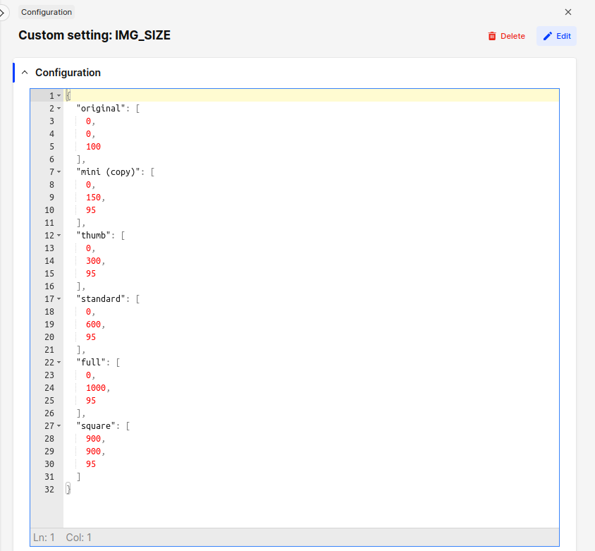
Examples:
- Size
"thumb": [0, 300, 95]will generate images with 300px height, proportional width, and 95% JPEG quality. - Size
"big2000x0": [2000, 0, 98]will generate images with 2000px width, human-readable size name is preferred by some people. - Size
"square": [600, 600, 99]will always result in a square, rescaling other dimension to fit. Warning: higher quality yields larger file size. - Size
"original": [0, 0, 100]will keep the original dimensions and quality of the uploaded image.
Please double-check your System → Configuration → Custom setting: IMG_SIZE and make sure the names of the sizes correspond with the sizes themselves, e.g. "1350x0": [1350, 0, 98], or "900x900": [900, 900, 98].
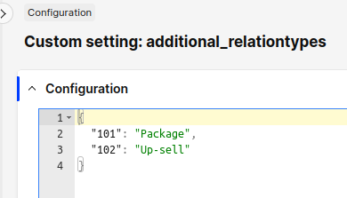
Custom relation types
Learn how to configure custom display relations in our FE guide.
Relation types have been moved from the PRODUCT section to a separate entry. Please remember to use relation IDs above 100.
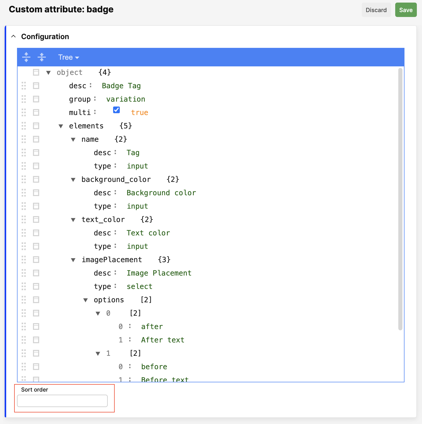
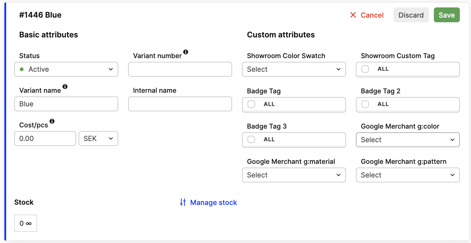
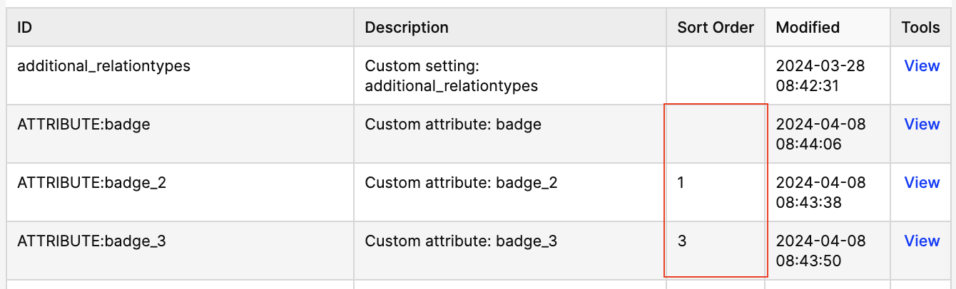
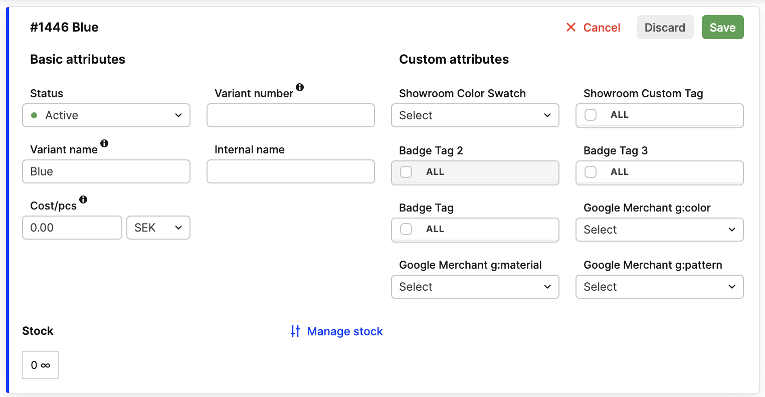
Custom sort order
By default, we sort custom attributes alphabetically. If you want to change the order, you can use a Sort order field to the attribute definition. Please note that you can change it only on editable attributes. The lower the number, the higher the attribute will be in the list. Predefined attributes are always sorted last.
Remember that empty Sort order is not treated as 0. It is treated as null, and the attribute will be sorted alphabetically after attributes with numeric sort order.
Fields in the attribute definition is placed under the main configuration:
Configuration list before change:
Product variant before change:
Configuration list after change:
Product variant after change:
Broke something?
Hint: Always click to Export the current version of your QA configuration and save it on your disk as a backup! But in case anything did not work as well as you expected, contact us to help you restore the previous configuration.